UI/UX design
Transforming ideas into screens
You have 3 seconds to convince your audience
Users decide in the first three seconds if your solution is worth using. Reasons they can leave are:
- Confusing navigation
- Ambiguous buttons
- Frustrating form validation
- Unable to find what they are looking for

“It’s a big misconception that design should primarily look good. Most people have never left a website because it looked bad. But most of us have left one because the experience was frustrating in some way. UI and UX is more than just pretty screens – it’s a smooth, intuitive, and most of all effortless experience.”
- Maja Horvatič,
- Head of Design
- at WagaLabs
Design should be
Intuitive
Users don’t like to think when using new solutions. The goal is to design for intuitive screens that are effortless and easy to follow.
Transparent
Design should be transparent. Users should know what to expect when they click a button, or open a new page.
Familiar
Where we can’t make it intuitive, we strive for familiar. The goal is not to invent from scratch, but to utilize familiar patterns and shapes that will make the solution easier to understand.
Communicative
Design should communicate the brand’s values. Whether you’re professional or friendly, modern or traditional, the choice of colors and shapes should reflect that.
The process

Ideas
Every great product starts with an idea. We first explore the concept, define your users, business goals and the competition. We explore different ways how to implement the solution and put everything on paper.
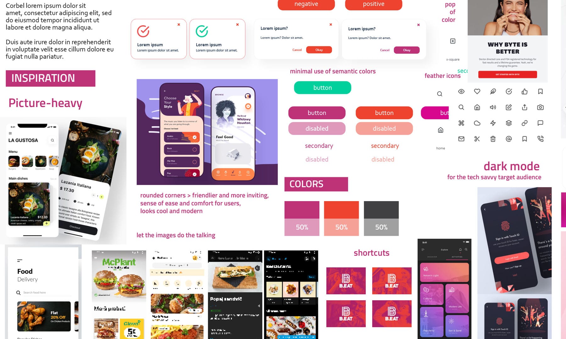
Moodboards
Moodboards define the look and feel of the product. We explore preexisting solutions, and define the colors, fonts and other visuals. We want to align the brand identity with the values and emotions we want to convey.
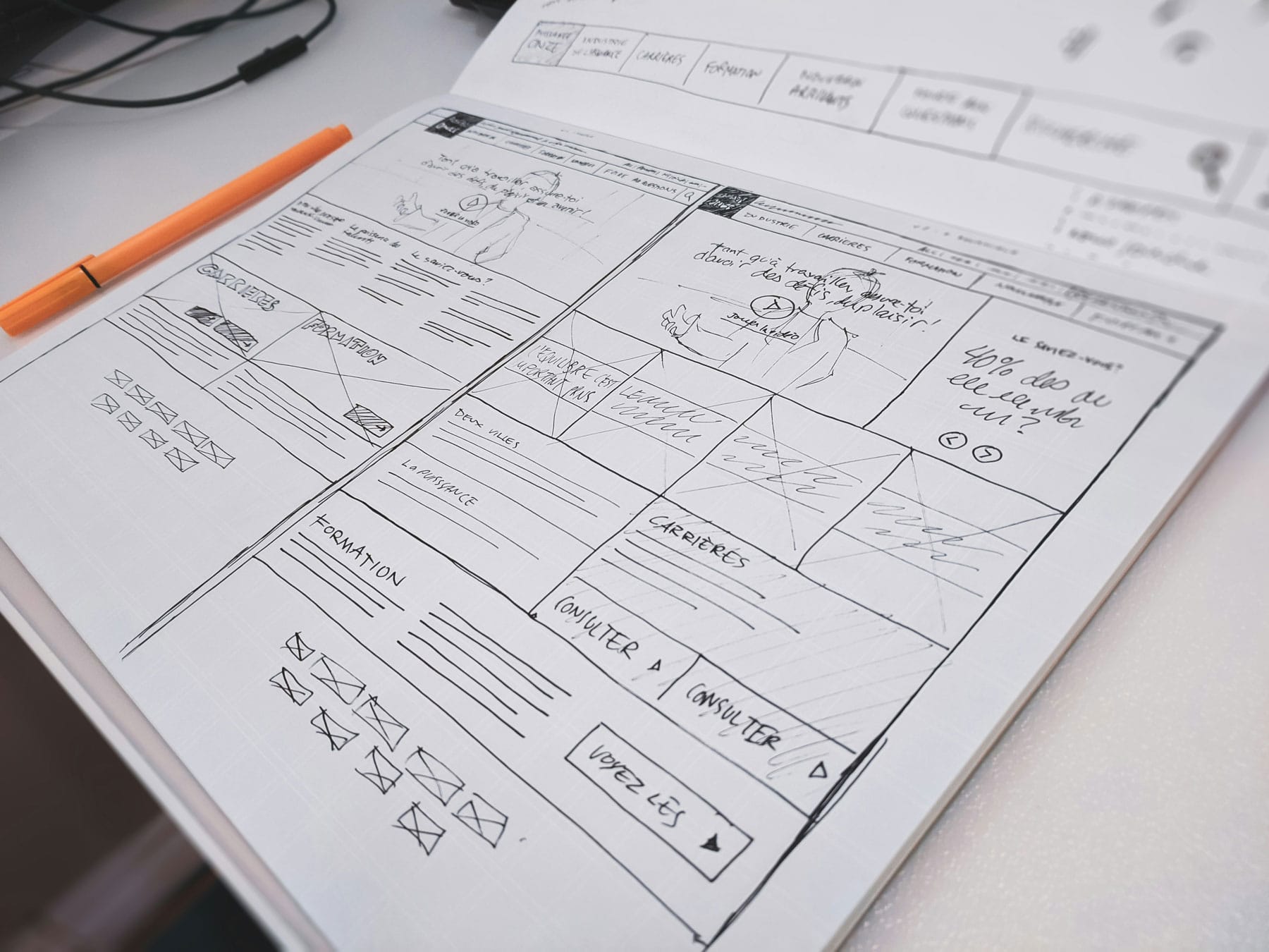
Wireframes
Wireframes visualize ideas. This step focuses on content only; which screens will we need, in what order, what kind of buttons we need, what kind of content and so on. This step should reveal the user flow without focusing on the UI.

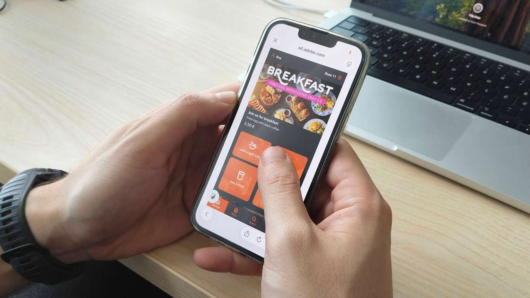
High fidelity prototypes
Finally, the wireframes and moodboards are joined into a polished clickable high fidelity prototype that’s as close to the final product as possible. We define the exact look and flow of the screens and prepare the design for the developers.
The result is a smooth experience
Nail the user flow before development even begins and you save precious time and resources changing things later. A smoother experience means less frustration and a higher conversion rate.